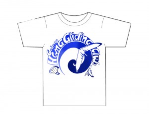
Logo Design Comp entry from Will in Central America (now that’s commitment!)
Hi all pilots
The spiral design which this logo is based on is based on the mathematical symbol of phi or the golden ratio. It can be found in many natural phenomena including the dive pattern of hunting falcons. It also represents new beginnings in New Zealand maori culture and for this logo also represents a rising thermal air current, which we all fly.
I thought we needed to sharpen, simplify and modernise our image to attract more people. I have included all three disciplines in the logo so that it belongs to everyone.
It will suit screen printing (t-shirt) or embroidery (cap) in different colours, however I think a white shirt with a blue design will the best due to our hot conditions. Blue is also the colour of the sky which adds more meaning to the design.
The logo would look best large on the back and a small scale insignia on one side of the breast on the front.
Maybe on the sleeve of the shirt or back of the cap the beautiful feather logo design could be incorprated, with simply the word “fly” next to it.
Great to see the website, and the blog is keeping me in the loop and I am looking forward to more flying adventures with you when I return in September.
Cheers
Will
PS I have kept a travel blog for the kids at school, so if you want to check out our adventures so far go to: http://sarahnwill.travellerspoint.com/


June 3rd, 2009 at 7:17 am
Vey Nice, Lots of though put into this logo. Got me really inspired to create a good logo thanks.
I am taking lessons in US, Here are my experiances Flying Like A Bird!.
I have also put together a How to get started Guide.
Hope this will help other aspiring pilots. Here I have my hang glidng experiances
Learn to Fly Basics (Lesson 1)
learn to Fly Basics (Lesson 2)